User Manual
This document is available in multiple languages
1. Introduction
The aim of the manual is to provide assistance to users in relation to the use of the available features of the application.
This manual focuses solely on the functions of the application; some functions are presented in Hungarian, but the application can be configured and used in English and German as well. In this case, news, events, offers and acceptance locations will appear in the selected language.
2. Login
For more info on the login process click here!
After installing and opening the app, the language of the app can be set to Hungarian, English or German.
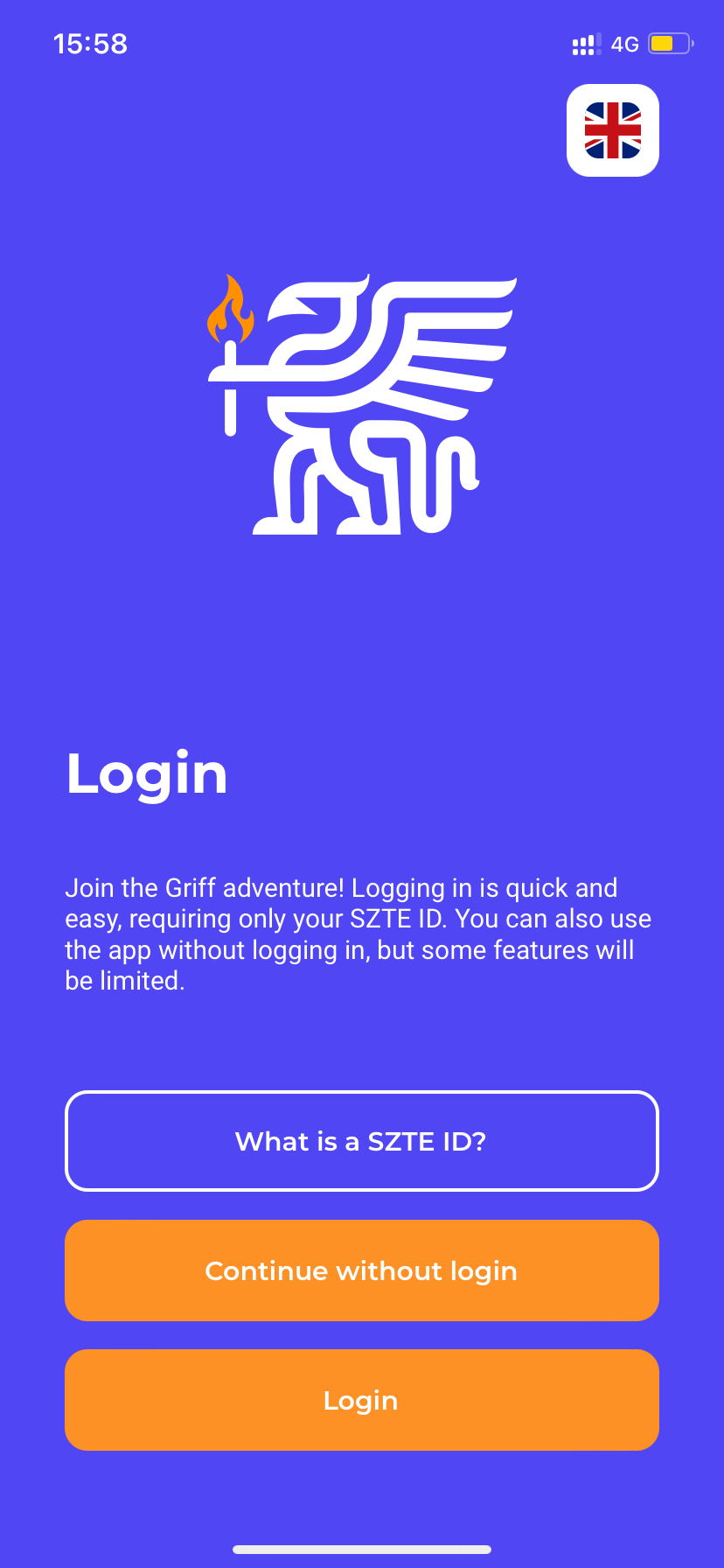
The user can use this interface to decide whether to use the application with or without logging in (see Functions available without login ). To log in, only the directory identification system of the University of Szeged can be used.
3. Functions available without login
Some features in the app are available without logging in. For example, news, events and offers can be viewed on the Home screen (Dashboard). From here, a dedicated list of these options are also available without logging in. However, the reader’s view of news, events, offers is a login required feature.
Login required functions:
- Profile;
- Onboarding (assistance);
- Notifications;
- News (reader’s view);
- Event (reader’s view);
- Offer (reader’s view);
- Acceptance Location (reader’s view);
- Marking of Event, Offer, Acceptance Location as favourite;
- Navigating to Event Location, Acceptance Location;
- TIKer;
- Personalised Campus Card;
Once logged in, in addition to the features above, Badges can be collected in a playful way.
In the following chapters of this manual, the functions available after logging in will be described in details.
4. Customization
After the first successful login, the Customize interface will be seen. Here, the user will need to enter a nickname, select an avatar and accept the privacy policy. Only then the user can proceed from the interface.
SZTE reserves the right to revise and amend the nicknames provided.
5. Onboarding (assistance)
Following the steps of customization, the Onboarding interface will automatically appear.
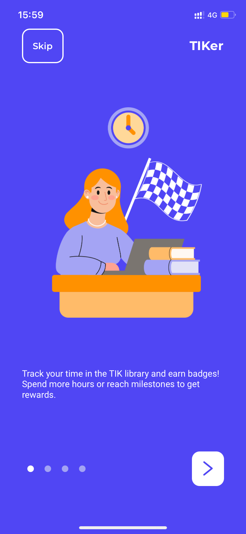
Once the onboarding steps are completed, the Newly Born Griff badge will be awarded to the user.
The Onboarding panel can also be viewed by tapping the Help button in the menu (marked with three dots) or by tapping on the Settings in the Profile menu.
6. Profile settings
Once logged in, tapping on the Profile icon in the top left corner, one can navigate to the Profile menu . The following functions are available in the Profile menu.
My badges
Here is the list of the badges already earned and those still to be earned. At the top the list the badges that have been earned can be found, followed by those that that are in progress and those that have not yet been earned.
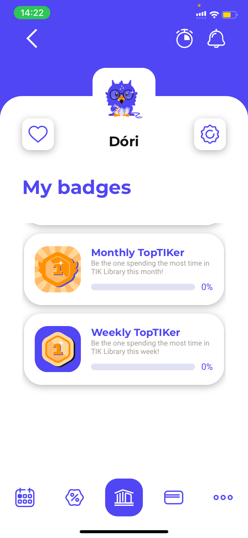
Once earning a badge, a Congratulations! notification will appear as shown in the second image.
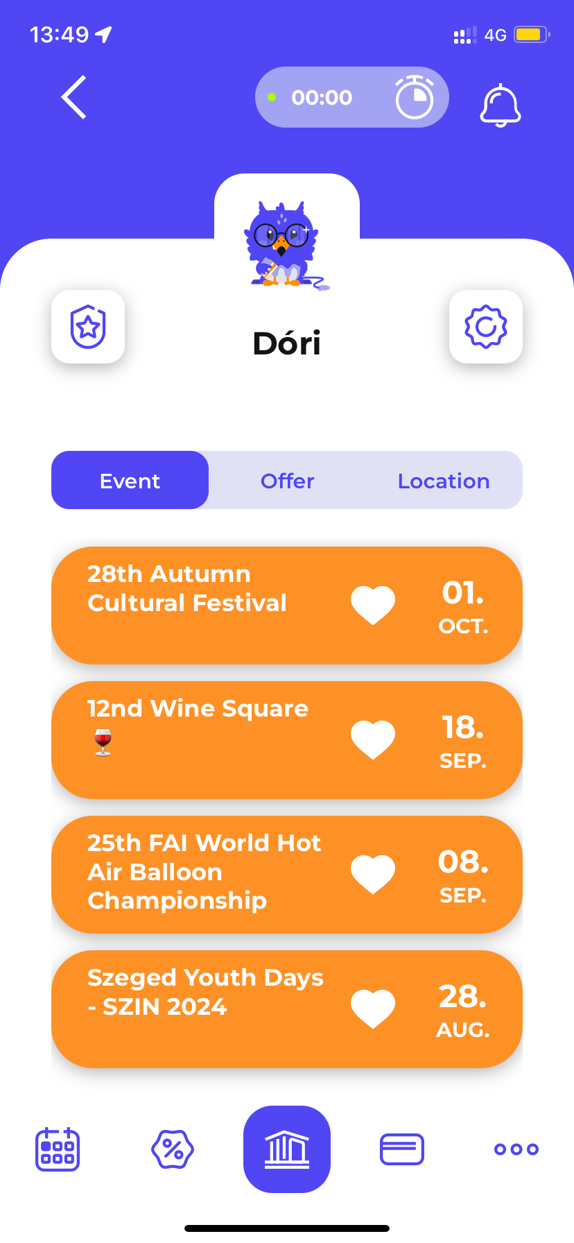
List of favourites
Tapping on the heart icon, the List of favourites appears where the previously marked favourite events, offers and acceptance locations can be seen.
If the user does not have a selected favourite offer yet, for example, by tapping the Offers button the user can navigate to the Offers list and mark one or more offers as favourite.
To mark an offer as favourite, tap on the heart icon on the offer card. Then the background of the Offer’s card changes from white to orange. By tapping it again, the favourite option can be unchecked.
Tap on the badges icon to return to the List of favourites .
Settings
The Settings can be accessed by tapping on the gear icon in the Profile menu . Here, tap on the pencil icon to change the nickname and avatar type.
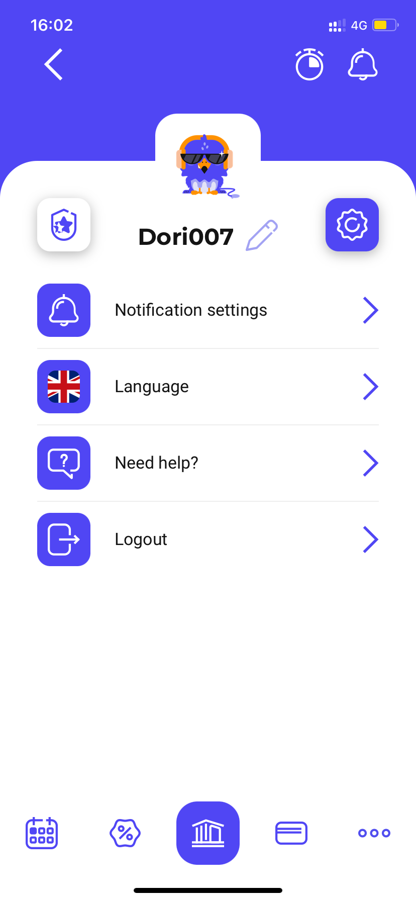
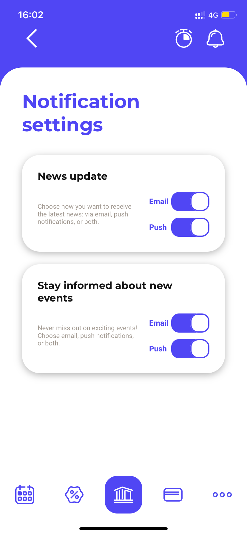
Notification settings
In the Notification settings , within the Settings menu, it can be specified whether the user want to receive e-mail and/or push notifications when new news or events are published.
Language
Within Settings > Language menu, the language of the application can be changed.
Help
Within Help > Settings button , the steps of the Onboarding process are available any time.
Logout
By tapping Settings > Logout button, the user can log out of the application. Following this step, only the features available without logging in will be visible.
7. Notifications
The Notifications’ list can be viewed by tapping on the bell icon in the top right corner of the app's interfaces. Unread notifications are shown in blue. In the case of many notifications, the list is scrollable.
The notification can be deleted by swiping left and tapping the trash icon, and it can be marked read by swiping right and tapping the mail icon. Tap the notification card to see a reader’s view of the notification, where the notification can also be deleted by tapping the trash can icon.
8. Home screen (Dashboard)
After logging in to the application, the Home screen (Dashboard ) is visible at all times. Here the updates can be seen in a scrollable summary interface. The Home interface can be viewed at any time by clicking on its icon in the menu bar.
News
In the News section, you can scroll page by page to see four featured and/or breaking news stories. The user can tap on the nNews card to access the reader’s view of the News. By tapping on the All News menu located on the right side of the News caption, the user can navigate to the News’ list .
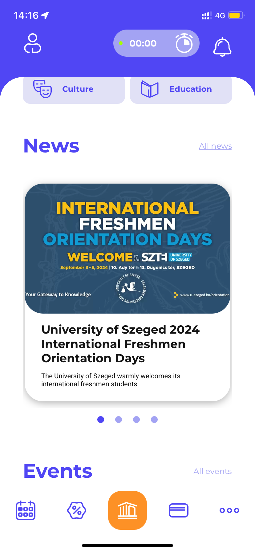
Events
In the Events section , three highlighted and/or the most recent events can be seen, one below the other. The user can tap on the Event card to get to the reader’s view of the event.
On the Event card the location of the event can also be seen and, by tapping on the heart icon, it can be marked as favourite (same for unfavoriting).
By tapping on the All events menu located on the right side of the Events caption, the user can navigate to the Events’ list.
Offers
In the offers section , the four most recent and/or highlighted offers are listed below one another. The user can tap on the Offer card to access the reader’s view of the offer.
On the offer’s card the acceptance location of the offer can also be seen and it can be marked favorite by tapping on the heart icon (same for unfavoriting).
By tapping on the All offers menu located on the right side of the Offers caption, the user can navigate to the Offers’ list.
9. Events
The user can click on the small calendar icon at the bottom of the interface to access the Events menu , where the
list of Events can be viewed.
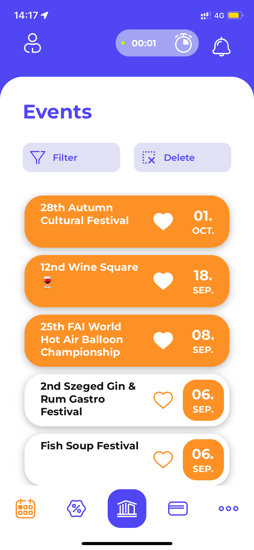
Regarding most events, the list is scrollable. By tapping on the buttons above the list, a filter can be set to events by category. If all or none of the categories are selected, all events are displayed in the list. The selected categories appear with a white background.
The event can be marked as favorite by tapping on the heart icon on the Event card (same for unfavoriting).
Event reader’s view
By tapping on the Event card , the user can access the reader’s view of the event, which can also be scrolled. In the reader’s view, the event can also be marked as a favourite by tapping on the heart icon (same for unfavoriting).
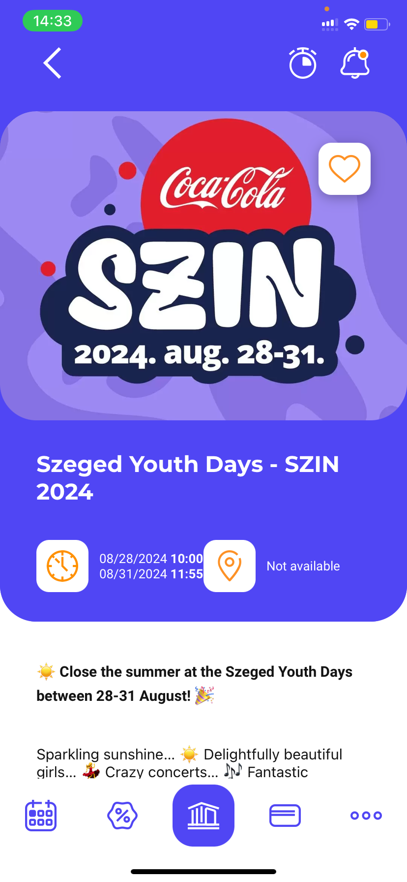
On the reader’s view, the date and detailed description of the event is shown, as well as, the location of the event if it is noted.
If the location of the event is noted, then the exact location on the map can be viewed by tapping on the location icon or on the left arrow icon on the cover image.
By tapping on the map icon on the upper left corner of the map, the route from the user’s current position to the location of the event is displayed.
10. Offers
The user can click on the percentage icon at the bottom of the interface to access the Offers’ menu, where the list of Offers can be viewed.
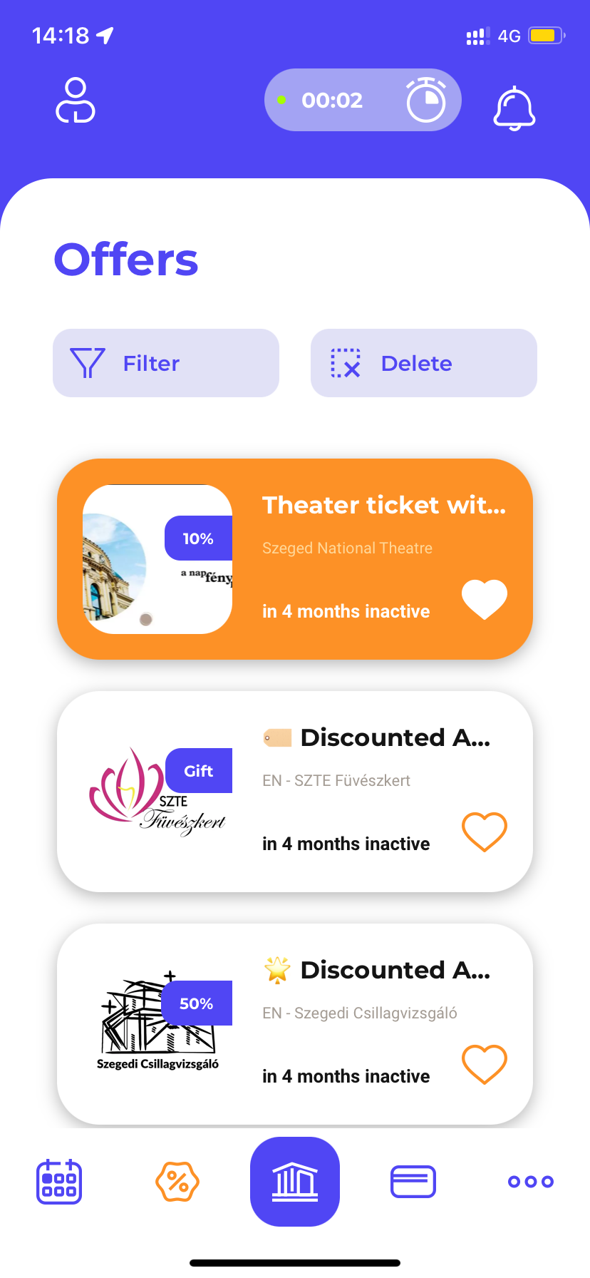
Regarding most offers, the list is scrollable. By tapping on the buttons above the list, a filter can be set to offers by category. If all or none of the categories are selected, all offers are displayed in the list. The selected categories appear with a white background.
By using the Filter drop-down list , offers can be filtered by discount. Multiple discount rates can be selected at the same time.
Offers can be arranged using the methods shown in the Sort drop-down list :
- highlighted up front,
- favorites up front.
The offer can be marked as favorite by tapping on the heart icon on the offer card (same for unfavoriting).
Reader’s view of an offer
By tapping on the Offer card, the user can access the reader’s view of the offer, which can also be scrolled.
In the reader’s view, the offer can be marked as favorite by tapping on the heart icon (same for unfavoriting).
On the picture below, the expiry date and the detailed description of the offer can be found. These details appear in the reader’s view of the offer.
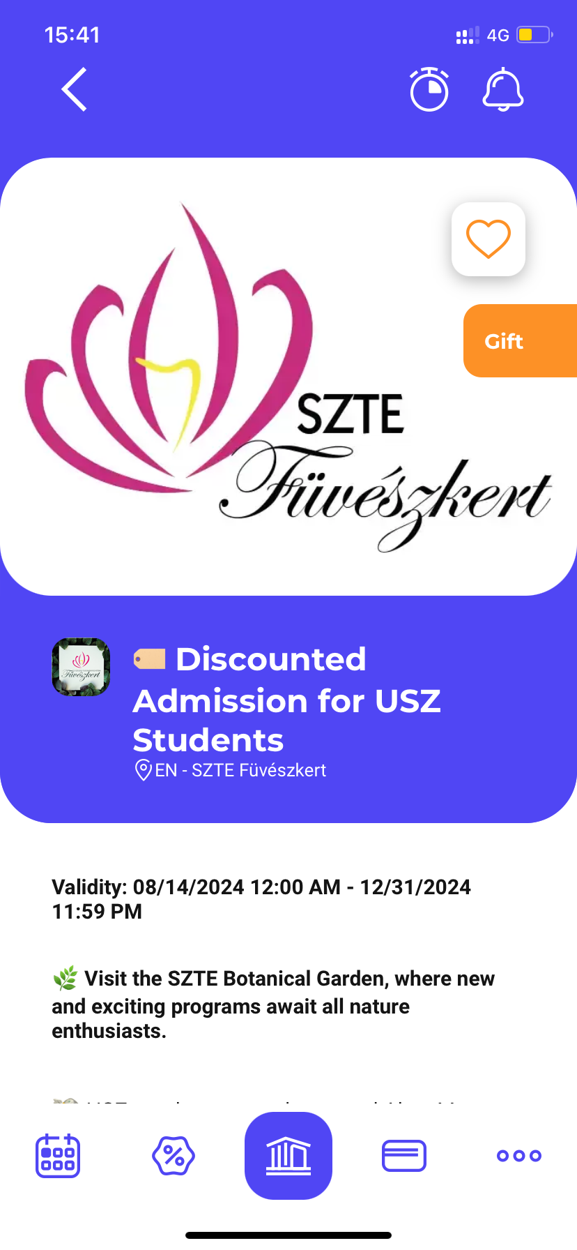
By tapping on the „More offers at the Acceptance Location” button, located at the bottom of the reader’s view page, the user can navigate to the reader’s view of Acceptance Location for the offer.
By tapping on the „ Validate” button, the user can view their virtual Campus card.
11. Campus Card
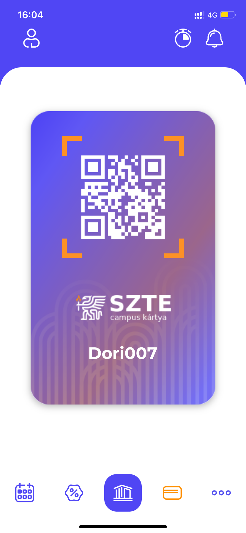
The user access and present their virtual Campus Card by tapping on the Campus Card menu . The personalized Campus card can be accessed by tapping on the card icon at the bottom of the interface. The card can be used to claim discounts, thus the card is also available in the reader’s view of the Offers .
12. More
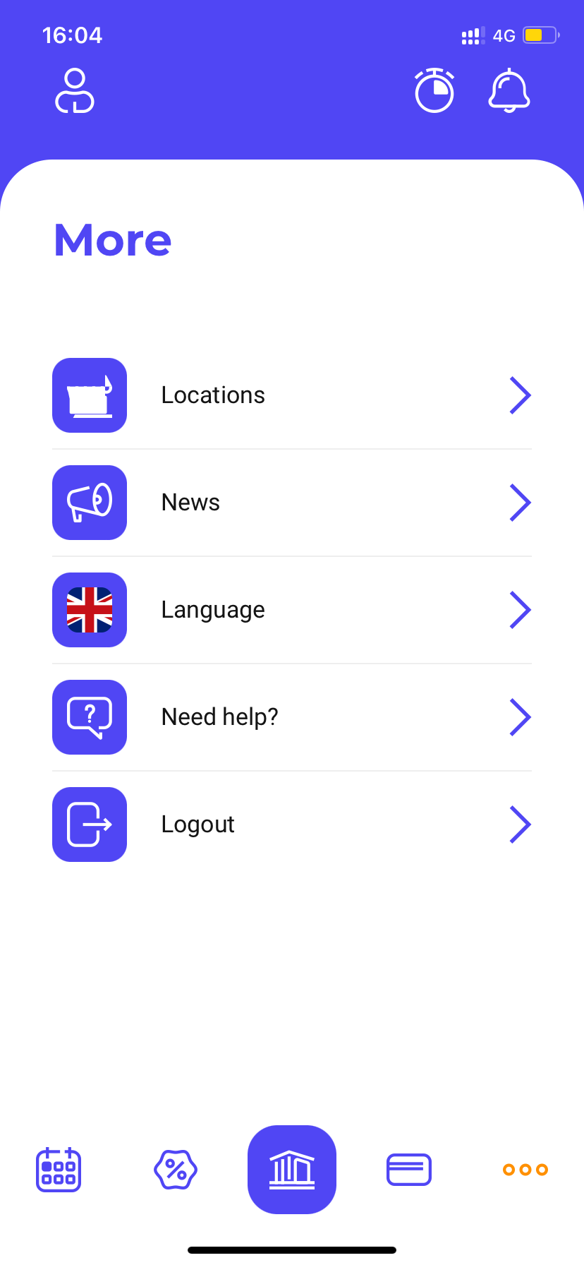
By tapping on the menu icon (marked with three dots) the following functions can be accessed via the More interface:
- Acceptance Locations: In the Acceptance Locations menu, the user can view the list of acceptance locations for active offers.
- News: In the News menu, the user can view the list of News.
- Language: In the Language menu, the user can also change the language of the application.
- Help: In the Help menu, the user can view the steps of the onboarding process.
- Logout: The user can also log out by tapping on this menu.
13. Acceptance Locations
By tapping on the menu icon (marked with three dots) the user is taken to the features presenting the Acceptance Locations. Here, the list of Acceptance Locations for active offers can be accessed.
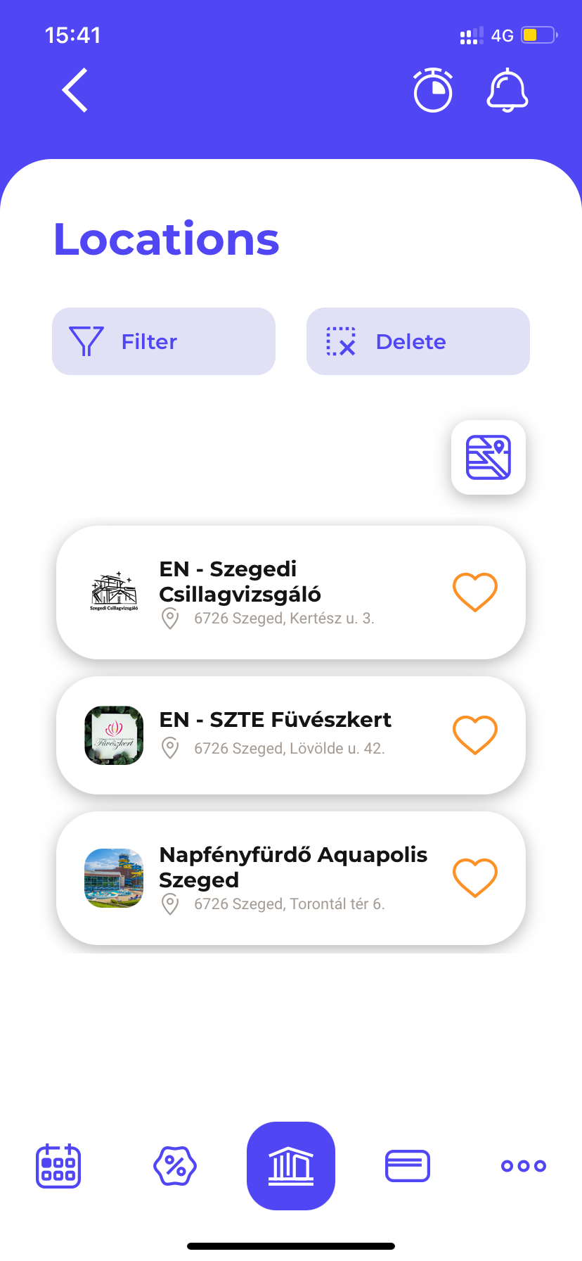
Regarding most acceptance locations, the list is scrollable. By tapping on the buttons above the list, the acceptance locations can be filtered by category. If all or none of the categories are selected, all acceptance locations are displayed in the list. The selected categories appear with a white background.
The acceptance locations can be sorted in the ways shown in the Sort drop-down list :
- highlighted up front,
- favorites up front,
- popular up front,
- most offers.
The acceptance location can be marked as favorite on the Acceptance Location card by tapping on the heart icon (same for unfavoriting).
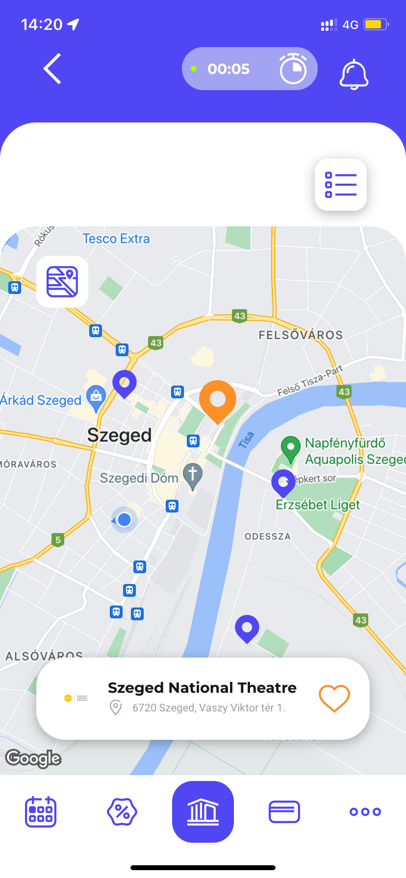
By tapping on the map button, acceptance locations can be viewed on the map. Tapping the icon marking the location, the card of the acceptance location appears.
Switching between the List and Map view with the same button.
Reader’s view of the Acceptance location
The user can navigate to the reader’s view of the acceptance location by tapping on the card of the location , which is scrollable as well.
In the reader’s view, the acceptance location can be marked as favorite as well by tapping on the heart icon (same for unfavoriting).
Here, the user will also find the detailed description of the location, as well as, the administrative location and the map of the acceptance location. The map can be accessed by tapping the left arrow on the cover image.
Tapping the map icon in the top left corner of the map will display the route from the user's current position to the acceptance location.
At the bottom of the reader’s view page, all the active offers of the acceptance location are visible. In this list, you can also mark (and cancel) the offer as favourite. Tap on the offer card to view the reader’s view of the offer. In this case, the All Offers label will help with navigating to the full list of the Offers.
14. News
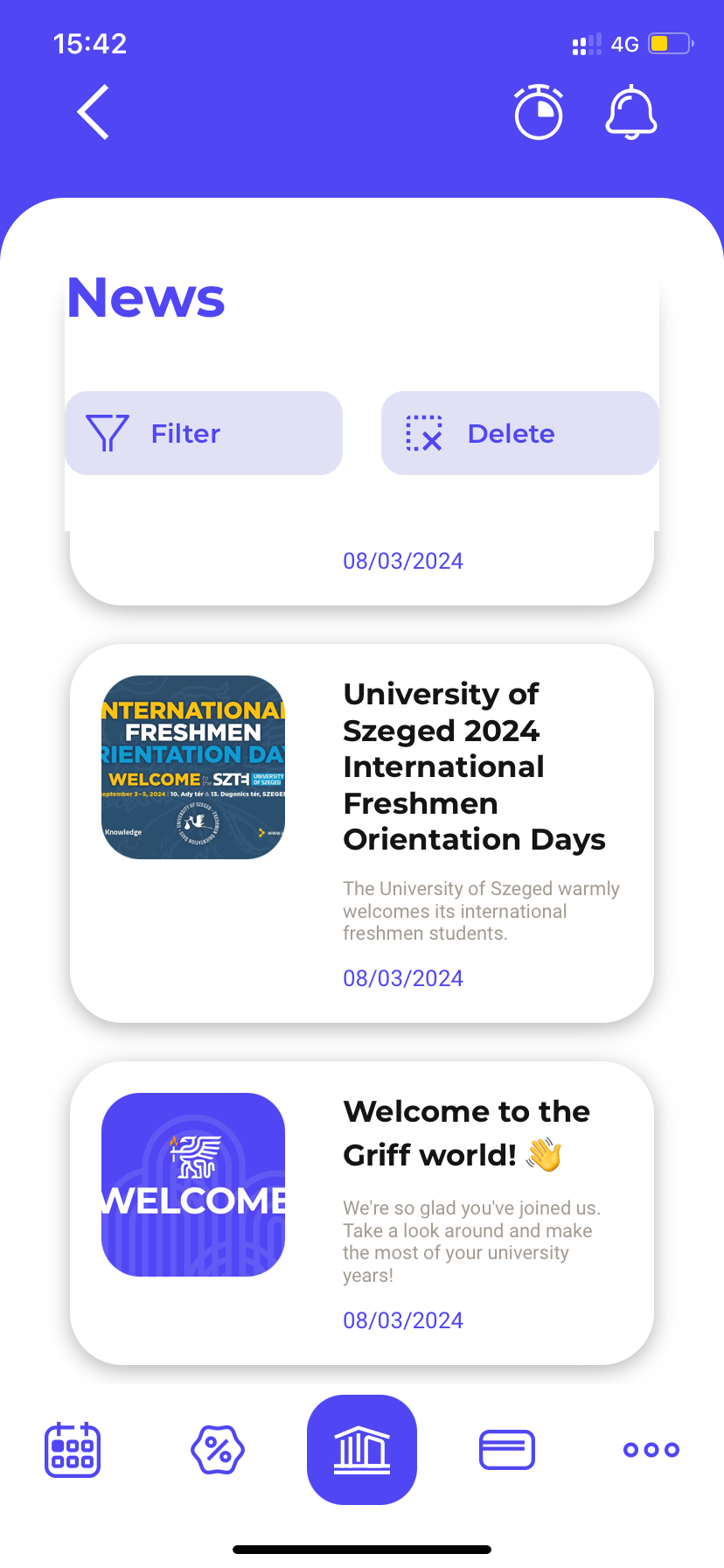
By tapping on the News menu , the user can view the list of News. In most cases, the list is scrollable.
Reader’s view of the News
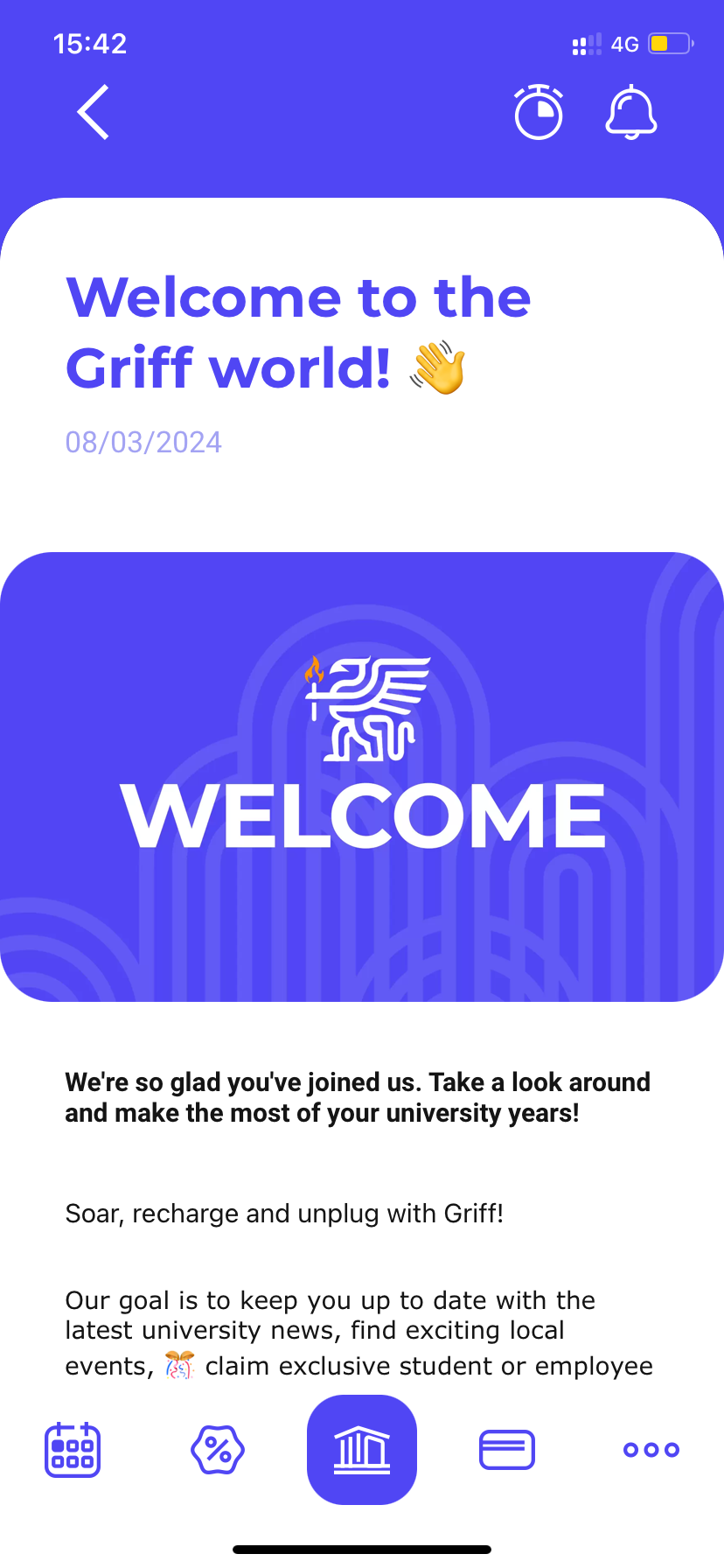
The user can get to the reader’s view of the News by tapping the News card . Here you can see the detailed description of the News.
15. TIKer
When the app is running, it can measure how much time the user spends in the TIK building based on the location of the user's mobile phone (if the user specifically agrees).
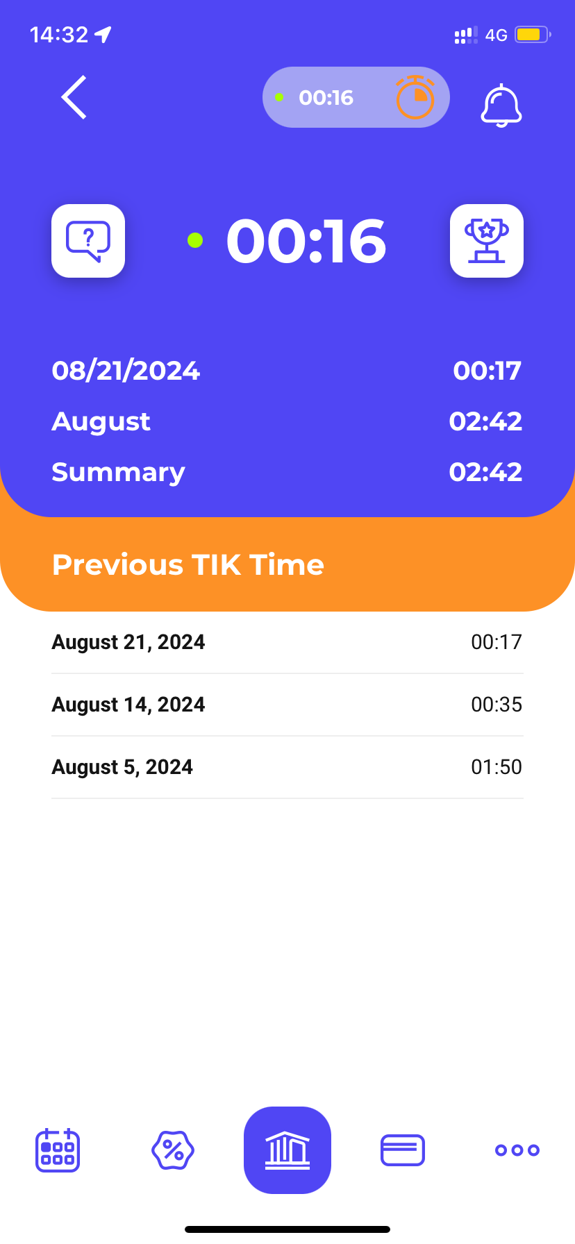
When the user arrives and stays within 10 metres of the TIK building within working hours, the TIKer tracker starts. It counts the time spent in the TIK building until the user leaves the area and returns within 5 minutes.
If the user returns to the location within the time limit, the counting continues. After leaving the area, the application saves the time of the previous TIK-visit and adds it to the user’s previous TIK visits when the area is visited again.
By tapping on the TIKer icon on the Previous TIK Time interface, the user can view the time spent in TIK, recorded in the application in daily, monthly and total basis.
The trophy icon opens the leaderboard, where the user’s ranking is visible.
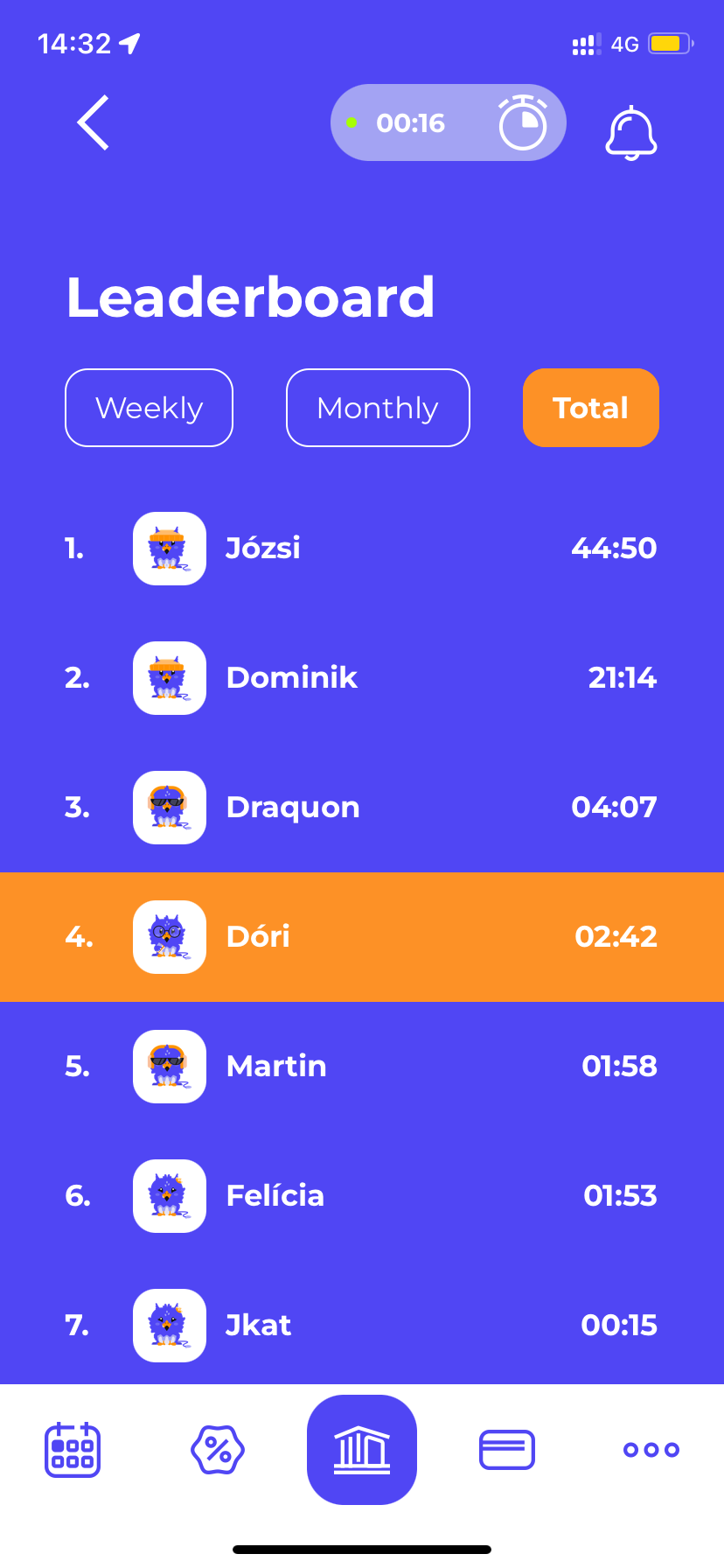
In the ranking interface, the position of the user can be viewed in three different time frames (weekly, monthly, total), if the user has already spent time in the TIK building using the app.
If the user has already reached a certain time as described above or has spent the most time in the TIK building on a weekly or monthly basis, then the user receives the TopTIKer badge for the achievement. The earned TopTIKer badge will be visible in the Ranking interface as well, in the order of achievement.
The available TopTIKer badges are the following:
- weekly TopTIKer badge: Spend most of the time in TIK this week!
- monthly TopTIKer badge: Spend most of the time in TIK this month!
- TIKthusiastic badge: Spend 10 hours in TIK!
- TIKTrekker badge : Spend 50 hours in TIK!
- Milestone TIKer badge: Spend 100 hours in TIK!
- DustBuster badge: Spen 250 hours in total in TIK!
The TopTIKer badges and the progress of their achievement can be viewed in the Profile menu > Badges interface.